Back from Rehab
In college, my painting professor gave us an awesome assignment:
1. Recreate a master painting.
2. Create your own painting based on what you learned from the master.
I chose one of my all-time favorites: Edouard Manet's Bar at the Folies-Bergere. I reproduced the original the best I could - from a poster print that I ordered from the Courtauld Gallery, onto canvas I stretched to the same size as the original (37.8 × 51.2 in - pretty huge!). Here is my reproduction:
I'm pretty proud of it. I really love this thing. It's really fun, actually, to trace its presence in all of my dwellings since college...
The second part of the assignment was a lot trickier.
I decided to imitate Manet's style and composition, but replace the bartender (and bar) with a modern vignette that all UVa students know and love: the bar at the Virginian. I got a tired redheaded bartender to give me a similar pose to the one Suzon made famous in 1882.
I must confess that I was the queen of all-nighters in the college art studio. I spent days, even weeks, sitting in front of a blank canvas, looking at inspiration images, doodling in my sketchbook, but NOT doing assignments. Maybe someday I'll post the paintings of my now-husband, passed out in the art studio, while I pulled an all-nighter painting him...
Anyway, I took the photos for the Virginian painting right before Christmas (AKA during finals) and photographed using FLASH - duh, that was a huge no-no. It looks terrible when you try to paint a person with flash lighting on them. It's so fake.
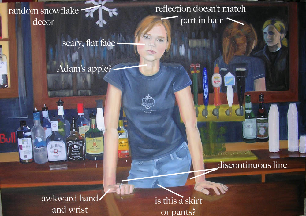
Case in point:
ICK! I can't tell you how much I hate putting this on the Internet, seven years after I originally painted it.
Let's begin to count the problems with this, shall we?
You can tell I did this in a night or two. Lots of mistakes.
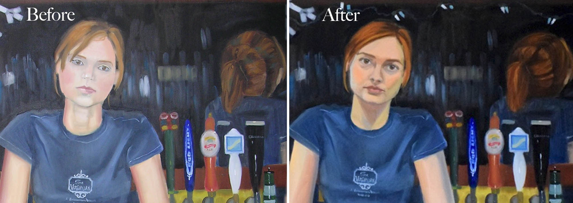
This poor painting lives at my parents' house, unframed, propped in the basement. It needed its chance to shine! So I finally took a paintbrush to it while I was home over the holidays.
I didn't have any of my original source photos, so I sort of made up a face, and got my mom to model the arms… thanks, Mom!
Added more obvious Christmas decor, fixed her wonky hand, made the figure more three dimensional, touched up the wood bar...
And finally, here is a comparison of the overall college assignment - parts 1 and 2:
It's no Manet, but I like the assignment nonetheless!
I still think the modern-day painting could use some objects in the foreground, and maybe more color near the top… but it's a heck of a lot better than it was before!
That's the beauty of paint… it's so forgiving, and there's always room to improve.


